23.4.10

Screenshots

Once I chose the font I wanted to use, due to its charactertistics which fitted perfectly well with the genre of the production, I began to edit and make changes that I needed to make in order for the title to contrast well withthe background. As the background on the top centre on the poster is black I had to changethe colour of the text hence I inverted it.

As shown above I took a picture of the props and main character, Audry II, and used it as a background. I think the background has worked really well because it includes the main key points in pictures such as the cenrtral protagonist, the florist shop sign - where most of the movie is shot etc.

I then placed the edited title in position rescaled and resized it supporting the background in such a way it sounds out. I wanted the 'horrors' to be at a larger scale than the rest of the text to reflect the genre. I thought this would be a good idea because having the same style of text and scale is very typical and average hence I decided to be slightly different. I deliperatly used an image of the plant as it is the central protagonist.

Although the white title against the black background contrasts extremely well, I don't nessessarily think it flows fluenty with the poster as a whole, due to this I decided to colour in the title red. As a result the title now looks like red blood dripping down which is very creative considering, once again, the genre of the production is horror.
Once the title was perfectly positioned I changed the font of the other text that included the important information of where and when the production is. I decided to use a simple yet bold font so that it would stand out against the busy background.

This is the final outcome of one of my experimentations. I ensured I included all the vital information by using a checklist and getting another student to go over it incase there were any spelling errors. As a whole the page is creative yet simple as I have not used many layers, I explored and discovered that this is a good technique to create a neat and presentable poster which is easily clear to view.

22.4.10

Poster Research


In order to conduct a good poster I used my initiative to visit various sites and look up previous posters which had been made for the show. I did this so that I could get an idea of how I could possibly be influenced to create my own ideas and form them affectively. I noticed that most posters included similar typography text and as a matter of fact I had also liked the idea of the font prior to looking at these designs. Majority of the posters also included a picture of the central protagonist, Audry II the plant, which also reflects back to my idea of adding the image too. By looking at the designs I can see how well the grading of darker tones work much better to those than lighter tones as it adapts well with the scary title. I would consider using a darker tone because I want my targeted audience to feel the fear of the production just within a poster. This could be a great outcome and really affective and I will take this in to consideration when producing my final design.

Publicity Campaign


20.4.10

Color Scheme


18.4.10

Advertising Responsibilities

  1. What responsibilities should be considered when advertising to the public?
When creating an advertisement to be promoted in a public area many aspects of it being suitable and appropriate should be considered.  Whether it is presented in text or images, certain subjects which may be included in an advertisement may be copy written or offensive hence the Advertising Standards Authority ‘ensure that consumers do not just enjoy the ads they see, but they can trust them too.’ Certain subject areas may include the following:
·         Drinking alcohol
·         Drug taking
·         Nudity
·         Smoking/cigarettes
·         Violence
·         Animal cruelty
·         Death & injury
·         Criminal acts
·         People doing dangerous things
·         Advertisers making untrue claims
·         Sexual content

2.   How did this impact on your promotional campaign for the show?
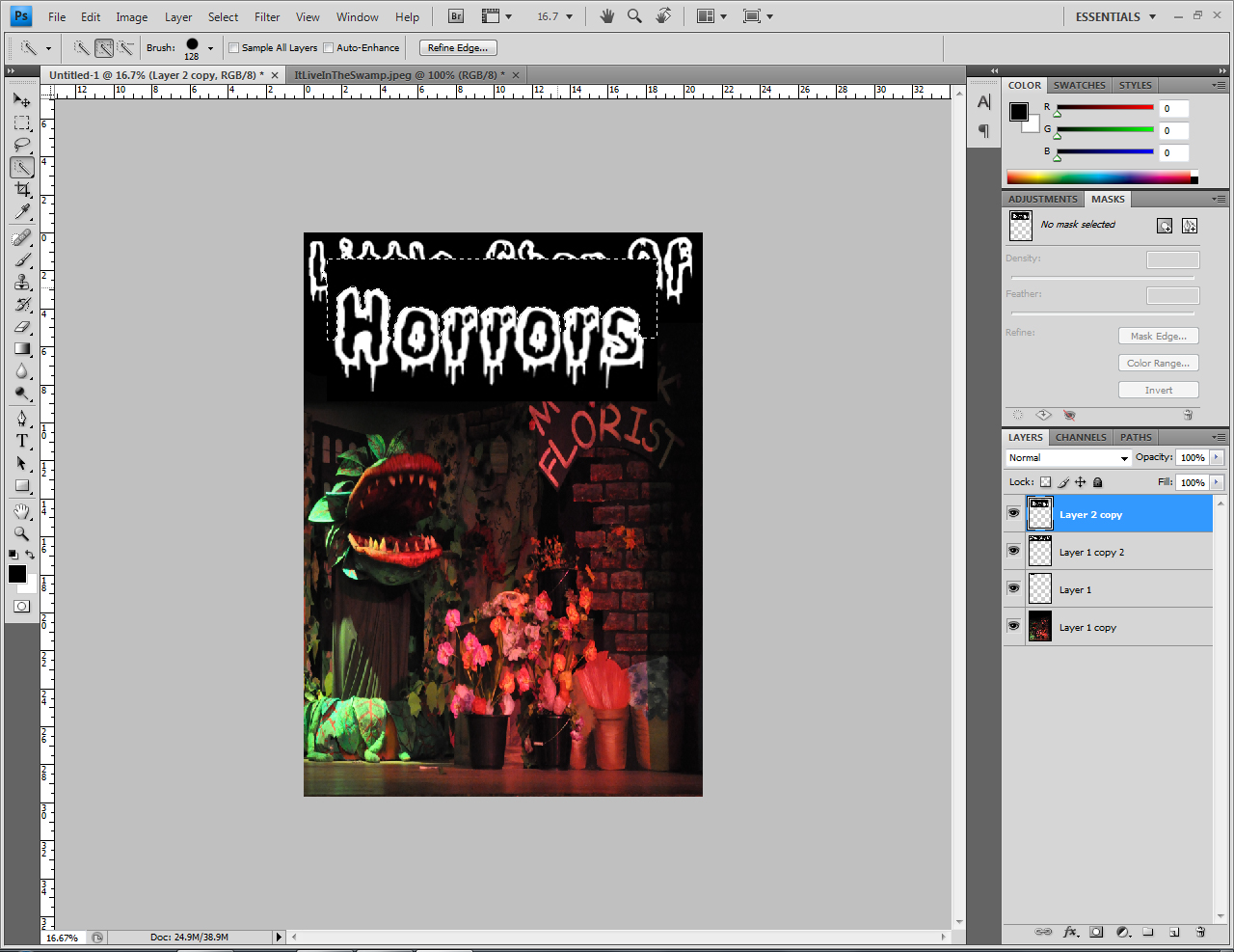
Although the poster I created for the production did not need to include any of the aspects stated above I still had to take in to account that any other aspect would not cause any offence or similar matter. During the process of creating design ideas the advertising code of its suitability enabled me to encounter obstacles as my first intention was to base the poster on a character from the show. My concern was that no actor wanted the poster to be based upon them. Even if I did find someone I would have to make sure they are not positioned or dressed in an inappropriate manner. Due to the fact that there were many aspects which could have a negative impact on the poster I decided to base my poster on something else.

The ASA are based in the UK, they are are an independent watchdog that prevent adverts which may cause and oblige to be false, illegal and offense. Marketing communications they work and deal with include the following: Print and press ads, posters, television commercials, radio ads, internet ads, banner and display ads and paid-for search) marketing communications on companies' own websites and in other, non-paid-for space under their own control, e-mail and text messages, direct mail, competitions, special offers, sales promotions, cinema commercials, teleshopping and more. By researching about the ASA I have enabled myself to gather key information that make the advertising standards authority unique and so powerful.
·         The ASA include of some of the world’s most strictest codes
·         An impressive 99.7% usually abide with the ASA rules
·         The ASA has a huge recognition for taking responsibility for regulating adverts
·         For nearly 50 years the ASA have control of non-broadcast adverts
·         The chairman of ASA is led by Lord Smith of Finsbury and is made both, broadcast and non-broadcast panels
·         They are a ‘customer focused organization’
·         The ASA work to the best of their ability and look at ad in perspective of the audience

The ASA interact with many other regulators who work under taking responsibility in regulations as some companies work broader in different sectors. The companies they have joined up with are the following:
Office of Fair TradingOfcomGambling Commission Financial Services Authority Food Standards Agency Medicines and Healthcare products Regulatory AgencyPhonepayPlus The Portman GroupTrading Standards

How important is regulation in media? Why?
If the media did not consist of regulations one could only imagine how corrupt the industry would become due to complaints. Having regulations diverse the right and wrong, the appropriate and the offensive. It is important that the regulations are considered a huge amount and those codes are met because by marketing and publishing wrong and false facts or images is the first step to destroying what we may in general, due to culture and religion, keep to and maintain our moral thinking. As important it is for businesses to market themselves, their services, events or any other subject which may need to be advertised in order to be successful, it is also important not to disrespect and ignore the codes that two very important committees in the advertising industry have written: the Committee of Advertising Practice (CAP) and the Broadcast Committee of Advertising Practice (BCAP). Overall this is because viewers, including young children, who observe an advert should not have to deal with a view they may see every day of their life which includes something being indecent, dishonest or disrespectful.

10.4.10

Legal Aspects

In regards to prove that we were not 'plagiarising' the script as our own and make people aware of this, any where the event was being advertising in written form we had to include the information above. It is a licence for us to advertise the show. Under all rights we had the oppertunity to act the production, however could not allow the audience, under any circumstance, feel that the script was written by us. As the information did not need to be baldly written in a huge size font, we kept the text neatly at te bottom of the handouts and posters in a small readable font and colour.

4.4.10

1950's New York Mood Board

A mood board is a form of poster design, which consists of images that describe or link to a keyword. The concept of mood boards helps graphic designers which is why they usually use them to illustrate a visual atmosphere. However they can also be used to visually explain a certain style of writing or a setting you desire. For each keyword a different color can be used as connotation and by using our creativity and imagination as acknowledge the right colors to use. By doing this we can send out a vibe of our choice for the viewer to feel. Within the images to create a mood board, various props, signs, logos, color grading, weather conditions are taken into careful consideration as a darker grade of a light source can change the whole image spark affect.

I researched which images to use for my 1950’S New York mood board by using different search engines however by doing some previous research I used a variety of keywords to search for more accurate historical detailed images. The search engines that I used were: www.google.com, www.gettyimages.co.uk, www.picsearch.com. However choosing which images to search for were picked out after creating a mindmap, i did this so that I could gather historal visual ideas which fit to set the atmosphere of 1950's New York. My mindmap parted in to four different main contexts, with the contents, included:

Florist Shop
-          Shop sign (Logo, Slogan etc)
-          Shop furniture (Counter, Table etc)
-          Flower
-          Big windows
-          Colourful
-          Big plant (Audry II)
Victorian (1800’s) architecture
-          Decayed woodwork
-          Sash windows
-          Gothic
-          Crumbly
-          Dull lighting
-          Brick work
-          Dull colours
-          Broken down
-          Peeling paint
-          Rusty
Old backstreet
-          Waster on the streets
-          Cobbled street
-          Crumbling pavements
-          Reflections
Neighbourhood
-          Dull colours
-          Working class/poor
-          Over crowded
-          Cramped
-          Boring
By creating my own mood boards I recognized how to select and edit appropriate images. I collected all the images that I thought best linked to the theme I resized the images in order of importance and then laid out the images on A3 paper. Initially I did this so that the main images were more eye catchier and could describe the concept of the theme overall. However I also used a few smaller scaled images to show a bit of detail about 1950’s New York such the shop signs and logos. I think the format of the mood board works really well as it is clearly able to describe the theme, 1950’s New York.

1.4.10

Planning; Timesheet


Planning a huge show can be very stressful hence having a creditability of naturalism in being organized is a huge bonus. Otherwise there is training ofcorse in order to gain the skills needed. As a group, soon to be opening a production show to an audience of 200 throughout two days in a row, we wanted to have all tasks completed on time therefore we created a planning sheet which stated when we begin to work on a task and for prefebly how long. My group and I included all the specific details for the production from props to advertising the event. Being organized is really important and to have a task completed before it is needed enables you to check through it and ensure everything is correct and ready to use at an accurate time. Every week we would look at the plan sheet to acknowledge what task to begin, we ensured we had all the materials to begin the task a couple of days before we start. This meant that we could go straight in to creating whatever needed creating without wasting time to run around last minute. The planning sheet helped my group and I a significant amount as we were able to reflect on all the work we had completed (by the end of it).