15.12.10

Final Evaluation


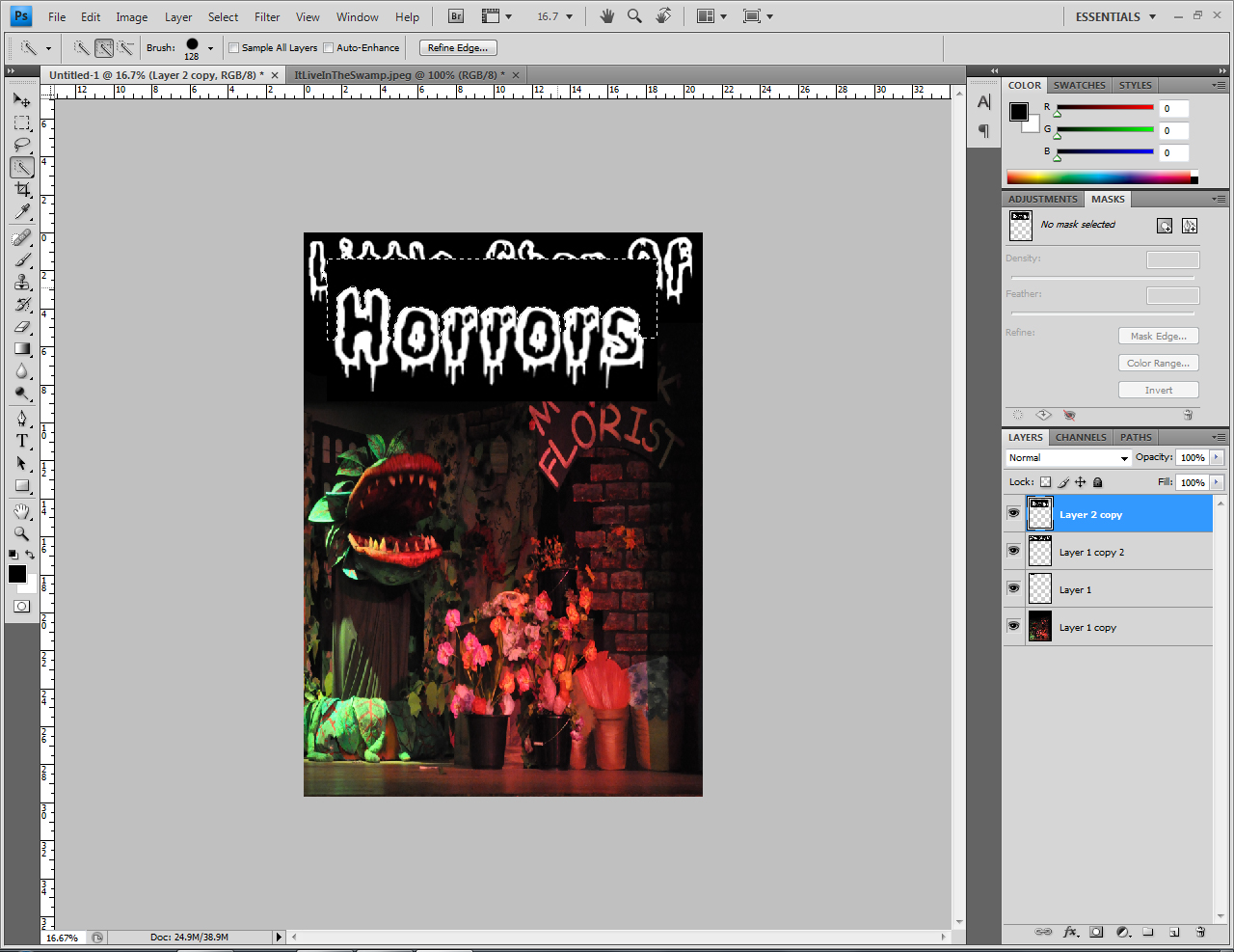
By completing this unit I have been able to gain an insight in the theatre and event management industry. I have always been fond of helping backstage in events, assisting and also taking leadership but whilst completing the tasks that I was given throughout the production made me realize I was growing a passion for it and would love to do something similar for living. The ‘Little Shop of Horrors’ production show was a real eye opener for me and right the way through I have been able to learn new useful knowledge such as what you need to take in to consideration whilst organizing the event and why, which aspects you need to cover so that you are not liable for anything to go wrong and much more. I feel that I have become aware of my strengths which were: I am organized and reliable to complete any task on time at a good standard. In opposition the task has also allowed me to become aware of my weakness; being: as ambitious as I am I didn’t like the idea of relying on other people to complete tasks as I prefer having full responsibility. However to me this is a positive weakness I can improve on, even though I am good at co-operating in team work my leadership instincts always kick in, but maybe someday this may just be a skill if I can wisely control it. Moreover, taking leadership and having the determination to be responsible for majority of the tasks is a huge advantage, not many people would want to do this and for me to step forward and want to includes a lot of courage. 

My favourite and most enjoyable task would have to be helping out backstage on the actual production show as it was so intense, I felt so challenged and it was a great feeling especially when the show successfully ended and I looked up to see the crowd giving a standing ovation. It made me really proud of myself and the group and everyone else who put in their time and effort as it all paid off. As an advantage I have also been able to enhance upon my communication skills and self-motivation. My main role included me to work within the graphic designs tasks which included researching previous posters, looking at typography, developing ideas and creating a final design. With previous graphic design skills on Photoshop and good knowledge of how to use a wide variety of materials I felt I was great use to the group. But this was the same for everyone in my group and so when one person pitched an idea everybody was able to contribute another idea to improve it as we wanted to achieve the best result of a poster which would work great with our target audience. Another point I have learnt and recognized during the process of completing these tasks is how important your audience is. Without an audience a show would not be possible because you would not be performing to anyone. In addition I have learnt that during each and every task and also whilst making important decisions and changes you should also pay a significant amount off consideration to your audience.

Doing this project made me aware of my talents in Set design and helped me make a huge decision. I want to study a subject similar to Theatre, possibly event management. I have proven to myself and everyone else that I have leadership, communication and team work skills and during the process I have only improved them.

13.12.10

Evaluation

1.      What practical work did you get involved with for the production?

·         Visual research
·         Graphic design poster
·         Stage management
·         Prop construction
·         Scene painting


2.      What did you find out about the timescale of pre-production work?

·     An Immoveable deadline means you start working along with more pressure as the dates get closer. To help you succeed to complete all tasks on time a reliable system management leader who is organized and prepared to give up a lot of their time can help to instruct all team members with tasks considering the time scale.


3.      What part did you enjoy or feel you were good at/bad at?

·    Graphic Design,
I liked researching visually using digital devices; search engines. I found that recognizing the real touch of 1950’s New York was an important element to get the most precise pictures and information for the poster. As a final point by using my creativity I was able to design a range of layouts and propose them to the rest of my group.

4.      Explain one element of the project you think you have learnt the most from?

·    Whilst working backstage I learnt the difficulties that may arise during a performance which need to be handled straight away. You must be prepared to face any obstructions that may cause the show to not run smoothly. You can prevent obstructions by working in detail, rehearsing as much as you can, keeping check lists and making sure everything is constructively working well. Having a system management is vital and can make a huge improvement in comparison to not having one at all.
You must also need to use precise measurements whilst creating the props and action prop construction. Rehearsing is very important to make scene changes and improvements also to discover queue’s to open and close curtains, different lighting (brightness, position, color etc), sound (volume) and use of props (placements, use, position – background, fore-ground, centre).

12.12.10

Audience Survey & Feedback

We discussed with the director of the show how we’re going to find out who our audience is.

· Finding out who our audience would be - actors family, friends, staff and community of the school
· Where the location of the show be held – school hall
· To whom will tickets be available - actors family, friends, staff and community of the school
·  Where will the promotional campaign be targeted – around the school site
·  How much are the tickets
·  Who does this show appeal to

Audience Survey
Did you enjoy the show?
What did you think of the sounding?
Did the props work well throughout the show?
Did the show flow fluently?
What would you improve about the performance?
Was the plant scary?
How well did the actors act?

Name: Jeet Patel
Did you enjoy the show? Yes
What did you think of the sounding? It was good
Did the props work well throughout the show? Yes, there was a good variety of props which made understanding the show easier
Did the show flow fluently? Most of the time
What would you improve about the performance? The concept of the show could have been clearer
Was the plant scary? For a younger audience it worked well
How well did the actors act? They were decent, most of them were quite confident

Name: Sukhmani Mohain
Did you enjoy the show? Yes, it was funny and very entertaining
What did you think of the sounding? It was good as it built up atmosphere including a lot of suspense
Did the props work well throughout the show? The scale of the props were really good, you could see it had been taken into a lot consideration whilst constructing them.
Did the show flow fluently? Yes however due to some of the actors tone it was slightly harder to hear the lines.
What would you improve about the performance? The duration of the performance was quite long
Was the plant scary? A little
How well did the actors act? They were good however I do think they could have been more confident

Name: Savneet Dhingra
Did you enjoy the show? Yes, it was quite entertaining
What did you think of the sounding? The sounding was really impressive; there was a mixture of songs sung by the actors and the actual soundtrack. I think the engaged the audience
Did the props work well throughout the show? Yes it was really colourful and set the right mood in the atmosphere
Did the show flow fluently? There were occasions where I didn’t quite understand what was going on, maybe a bit more practice would’ve improved the quality of the show
What would you improve about the performance? You wouldn’t really be so interested in a show where the actors are really nervous so maybe a few more rehearsals were needed
Was the plant scary? To be honest it was more humorous
How well did the actors act? The actors were very confident hence there tone of voice was not so clear which caused a lot of confusion

Name: Mukesh Chumber
Did you enjoy the show? A little, it could have been better
What did you think of the sounding? Sounding was good, went great with the script
Did the props work well throughout the show? Yeah they were really creative
Did the show flow fluently? Yeah, it was a script from a well known drama play so obviously it made sense
What would you improve about the performance? Could have been a bit more live
Was the plant scary? Yeah, the outcome of it was really good
How well did the actors act? They weren’t so bad

Name: Gurpreet Bains
Did you enjoy the show? Yes it was really good; a lot of people from the audience enjoyed themselves. Especially as the actors interacted with the audience
What did you think of the sounding? There was a great mixture of sounds which was good as they didn’t use the same sound over and over again
Did the props work well throughout the show? Yeah, whoever created them deserves great credit because it went really well
Did the show flow fluently? Yes
What would you improve about the performance? Nothing in particular, there were probably a few little mistakes however you wouldn’t expect it to all be perfect
Was the plant scary? As a combination of being scary and funny it was good
How well did the actors act? They were good enough

Other members from the audience also said:
“It was very professional looking for a student production. The lighting and sets made it look very convincing”  Mrs. Bansal (Mum 39yrs)
“The show was amazing! Really lively and colourful.” Anisha (14 yrs)
“To be honest I was quite amazed of the standard of talent many of these actors and actresses have, it is very impressive!” Danny (Friend of actor 23yrs)
“Really great performance, great view of the whole production throughout the show!” Mr Richard (Father 44yrs)
“ I wish I had known it was going to be that good, I would have auditioned for a part. It felt like a professional musical” Amrit (13 yrs)


By looking at the results and the comments, the majority of people from the audience enjoyed the show and were quite happy with it which is a great outcome however the main problem occurred was that the actors whom were not clear enough. When I attended rehearsals to observe how the actors were processing throughout the stages I had noticed many of them were excited unfortunately there were a few actors who had a bit of a stage fright. To help them I was able to give them advice to make them feel more comfortable, and they did however I presume with a large audience on the two nights they got more nervous than planned. In addition, in my opinion, I think that on the first day of the show many of the actors showed a little stage fright however by the second day they were much more comfortable. In conclusion I have learnt that 'practice makes perfect' is a perfect saying that intertwines well in this sort of situation. Next time when i undertake a similar task i will remember this so I can improve and result with a better show, which hopefully all the audience will be happy with.

16.11.10

Importance of Audience

For any show an audience is always included, whether it is a big crowd or a few member it is still an audience to whom you are presenting to. For the best outcome of a show you need to be able to satisfy everyone in the audience. For every process of the stage to create the production show ‘Little Shop of Horrors’ I took in to consideration the audience, for every decision I had to make I would always ask myself , would this be suitable for the audience? Will the audience enjoy this? How will this affect the audience? As the shows actors were about 13-14 years of age we figured that the targeted age range of a younger audience would fit best to attract more people to attend the show. With this in mind however we know that as students participating in a school show their parents/guardians would also attend to show support and just generally see how proud the kids have made them. This then led us on to think instead of having just a limited younger age range why not have another age group as we want as many people to attend the show. This didn’t limit us to whom we were targeting, even though this could jeopardize some of our ‘childlike’ ideas we had in mind as we needed ideas to interest a younger and older audience.

26.9.10

Helping Backstage

Day One - Monday 8th March 2010
As the show of the production “Little shop of horrors” was going to commence at 7pm prompt, everything needed to be done preferably during the day and so as instructed by our client: head of drama Ms Jones, all backstage helpers including myself set out all the props in position on and off stage. As time was value we hurried to allocate the furniture i.e. chairs, tables etc to the main hall at Heston Community School where the production was taking place from the other school building. At approximately 6:30pm the audience had started to arrive, at this time many of the students including myself and a few members from my group and senior students from Heston Community school were at front of house to greet, check tickets, guide everyone in the right direction and provide them with a leaflet containing names of the actors/characters, special thanks message, poster and important information. During the performance we were able to acknowledge when the props, scenery and furniture needed to be positioned, changed, added or removed as we had rehearsed this several times before hand, we were organized hence everything flowed fluently without a problem.  By the end of the show I was able to get answers from the audience I was interested in to investigate by asking them to kindly complete a survey.


Day Two - Tuesday 9th March 2010


The second day was just another run down of the show; however there is always a bit of improvement in similar tasks as organizing an event. By acknowledging the reasons of a few obstacles which arose on the first day my group and I were able to find solutions for it not to happen again; leading for a more better and successful show. One of the issues we were able to sort out was the volume of the music. We noticed on the first day it was not as loud and clear as it needed to be and this really confused the audience as they were not able to understand the script well enough. The actors were much more confident and comfortable on the stage and you could notice the difference. In conclusion the second day remained a success as it was on the first and in addition a more improved show which left many of the audience speechless.


Within the two days of helping backstage I was able to learn how important it is to be organized in detail and be able to communicate clearly among whom you work with. I strongly think if you lack either of the two it can be very difficult and if you come across any crisis you may be in a lot of trouble. Having researched about the role of an event organizer and experiencing it myself, I now know that you need to be quick in making decisions and being very certain they are the right decisions, especially if it is live during a show taking place. You should be confident and show off your effort as should be your best!

17.9.10

Final Props and Backgrounds

Whilst creating the props and backgrounds for the stage of the production 'Little Shop of Horrors' a lot of thought went in to it. We looked at moodboards to identitfy the atmosphere we wanted to achieve, experimented with materials, developed ideas after being influenced by looking at images of real theatres and much more. The costumes were chosen by the teachers as they wanted to make sure all clothes were appropriate for the audience. Once provided with the costumes me group and I styled them to make them look like old fashion clothing accessorized with a similar feel. A lot of the flowers which were used in the flower shop were created using different materials, primariliy we wanted to experiment with the materials but after positioning them on stage we really liked them all. Whilst producing the props we conducted measurements to achieve sufficent space for all the actors to perform. In addition to all the entertaining props around the stage we also had a live band play on the night which was absolutley fantastic, it was more jolly and more interacting. The lighting was perfect as you were able to see all the actors clearly, the colours of the lighting also went well with the background and produced a great contrast.

18.6.10

Plant Design

Before starting to construct our very own Audrey II (the plant) for the show my group and I researched how you could build the plant, way to plan the construction, look in to different measurements and which colors to use to intertwine both themes together.
A lot of our time was spent on discussing the process and figuring out how it would work best. We needed the plant to be life size so that someone could wear the costume throughout the show. We took measurements of a member of our group and decided to apply ourselves to work with them.  Due to using a real life size measurements we had to take in to consideration that someone will actually be in the plant which will consist of a lot of movement during the show. There also needs to be easy access to enter and exit out of the plant so it needs to be quite spacious. By using the correct materials we began our construction, throughout the process we were all determined for a great outcome bearing in mind we had an immovable deadline, which meant the pressure was on.


These are a few pictures of my group and I whilst designing and creating the plant. We spread the work load between all group members in order to meet an immoable deadline on time. We used a wide variety of materials to create the props and this was really affective as it gave a different texture and variety of color which made the show more lively.
This is an image of the final outcome of the plant on the stage. As we measured the plant before creating it, the scale of the plant was perfect and spacious for an actor to work it manually throughout the show.

16.6.10

Stage layout design


Designing the layout of the stage is one of the most important tasks. By learning key important terms in the theatre industry such as down stage, stage blocking, sightlines etc, my group and I were able to design a layout for the stage. Firstly we enabled ourselves to acknowledge how much of the staging area we were covering by taking measurements. This was necessity in the process as we would eventually need them to create the props. Then we went through the script chronologically to acknowledge what objects such as chairs, tables and props were needed and where. Our main layout was the layout which includes majority of objects which used throughout the show. Whilst during the whole process of laying out the stage I was able to recognize some pointers which I had learnt such as, whether you’re organizing a huge or small, an outdoor or indoor show, exhibition, fashion show or any type of event a run through of the design layout is always needed. It is one of the most vital tasks and if it is done properly there is a high possibility for the event to go very unsuccessful. It is also why rehearsals are performed before hand.

7.6.10

Stage Design


To visually communicate our idea of the background for the show we created set designs in smaller scale model boxes. To decide on which photos to use I researched the time of the play and where it was set which was: 1950’s New York. I created a mood board and then went on to choose the best images for a perfect setting. Between each group member we showed our ideas. We discussed and analyzed them to select which setting would go best for the show. As soon as the decisions were made we wasted no time to start creating the backgrounds. We used a variety of materials such as: painting, oil pastels, fabrics, tissue paper etc. During the process we took in to consideration the size and that some backgrounds would need to change during the show as the whole film was not set in one setting. With all our creative minds and knowledge by thinking and discussing it out we were able to successfully build the perfect backgrounds.

3.6.10

Final Designs


This is my final design of the production leaflet and poster conducted by my group. Due to using intense research of the production I was able to start recognizing how I could form a poster where the viewer could acknowledge the genre of the production, in relation, in our posters I think we have achieved this by taking in to account the colours, images and typography used. As seen in my planning you can see that initially we wanted the leaflet/poster to include images of the central characters in the production. This was focused upon as we wanted to give a slight hint of the storyline as a teaser. For a wide range of targetted audience we took them in to a huge importance of consideration so that the design would be suitable for them. So we decided not to create the poster too “childlike.” I would personally describe the poster as formal, imaginative and interesting. All the information was clearly stated in a ‘Times New Roman’ font as we did not want the A4 sized leaflet/poster to look too busy as this could look a bit messy and not thought about whilst producing the layout. I believe the design looks absolutely professional; I would definitely be able to use it if I were organizing the show in a huge theatre. It works well for a wide target audience and covers all the aspects of looking like a horror, sci-fi and comedy musical production.

22.5.10

Typefaces

The above font is called Feast of Flesh, which caught my eye as it is three main things which an eye catching title should include; Bold, Big and powerful. Furthermore, the font is very easy to read which I felt is very important as it helps more possible and interested viewers identify the poster, where ever is maybe allocated in order to advertise the event, and this is important for those who place perfection in their work as a number one decision maker when choosing what developing a title for a poster.

This font is called Treasure and I believe that this font will work well as a title due to the fairly bold lettering as well as the formality of basic lettering it shows. Due to my magazine being aimed at the large age range from kids to adults, I want a passing viewer to not feel as if the show would not be suitable for whatever age they may be. 
This font is called You Murderer. I was very interested in this font because the style of the writing links to the horror genre directly due to the rough and distorted lettering. There is also a liquid which seems to be dripping off the text which can be associated with blood. This will be highly effective for my poster due to the direct link and connotations the text gives off which is similar to horror characteristics too.

This above typeface is called blood gutter 2000, I find that it is too basic for an adventurous and creative poster I would like to produce in order to attract a large number of viewers. The typeface is far too simple and although it initializes that it is a horror themed font I think it has been created effortlessly hence looked unrealistic. Due to the reasons stated above I find it very difficult to picture this typeface on an astonishing poster I will create therefore I will not use it.
This font is called Meltdown MF. This font caught my eye because it is bald and still adds in the characteristics needed in order to make it look like a title for a horror genre poster. I particularly like the face that I will be able to colour the inside of the typeface on photo shop and even change the colour of the outline if I wish. In regards to my targeted audience I think the font fits well with the wide age group as it may come across as a childlike font yet formal as it is bald and easy to read with its clarity but in a creative method. 
This font is called Ghost Writer. What particularly and instantly interested me in this font is that fact that it looks like it has been stamped on and in the 1950’s, when she show is set, a majority of people used to create typefaces using tools such as stamps, typewriter etc. Moreover, although it is fairly simple and basic, with a little bit of photo shop work done upon it, it can look very mysterious and this, in my opinion, is a highly effective characteristic to use in a font for my chosen genre and especially to attract an audience.
This font is called You Murderer. I was very interested in this font because the style of the writing links to the horror genre directly due to the rough and distorted lettering. There is also a liquid which seems to be dripping off the text which can be associated with blood. This will be highly effective for my poster due to the direct link and connotations the text gives off which is similar to horror characteristics too.
The font above is called It Lives in the Swamp, this font to me looked very similar to the font Meltdown MF and due to its similarity I was also interested in this font. I noticed that it looked like a “new and improved” version of Meltdown MF only to be produced balder, scarier – with a more realistic look of blood dripping from the text and creepier font.  It is a conventional font and fits perfectly with all the characteristics needed which would flow fluently, alongside the pictures and other texts, on the poster well.

19.5.10

Typography Experimentations

For every show an audience is needed and for an audience to know there is a show, it needs to be advertised. And so to urge people to attend the event of the ‘Little Shop of Horrors’ production we decided to produce posters which would be located around the school and around the community where people could easily become aware of the event. We took in to account:

      ·         The poster needed to be easy to read so that one walking past could take in all the main details, and could possibly approach the poster for further details.
·         It needed to attract the students and teachers, meaning a broader age range
·         It had to include the copyright information for legal reasons
·         The theme of the show which we wanted to visually communicate through the posters using the right colors (research color connotations)
·          What images could set the atmosphere of the production on a 2D layout
To begin with, after many discussions based on how we could create the poster we decided to experiment with various layouts, typography, images, colors etc for the best result.
I started off with experimenting and looking in to a wide range of typography. I created my own freestyle using different materials and also created some titles digitally. Within my typography experimentations I used different themes using visual metaphors for example, one where I have used red ink dripping down as if it were blood. I also looked at different layouts for the title ‘Little Shop of Horrors’.  In my freestyle and digital experimentation I used a lot of green and red which relates to the plant (Audry II) and danger. Many of the typographies worked very well and lead me to more ideas that I could work with and improve on.


13.5.10

Experiment: Poster design

This is a poster is designed and created using Photoshop. Although it needs a lot of improving and development I can already notice that the layout works really well. It is a very basic design and as it is a lively musical production I would improve the poster by making it look more lively, maybe by adding a background. In relation the background could pin point on the poster that it is set in 1980's New York. The colours are really vibrant and consists of good grading.

11.5.10

Poster layout design

In order to produce a poster we contributed, within our groups, our very own ideas. I was able to draw up three of my ideas I believe had a good potential to work really well. As it’s a rough idea which will need to be pitched to the group I have briefly written why and what I have chosen and where it should composition on the poster.


My first idea (image above) is a strong cover which gives away the genre of the show and also the concept (scary plant scaring away a boy and girl, main characters, in a shop.)  I have briefly analyzed the colors connotatively and illustrated why I have chosen them. I think this poster design idea works well because it gives the viewer an idea of the concept of the show and this is the breaking point if whether they would be interested of not. The pictures are nicely laid out on top of a brick wall; I got this idea whilst looking at my mood board and so I can instantly see this gives a 1950’s New York feel. I would however improve the title, if I could change it I would chose something which relates to the genre of the show as the pictures already do.
My second idea (image about) is of the plant alone, in my opinion I think this is a bit of a teaser as it doesn’t give away who or what else may be involved in the show and this is a great technique to interest a passing viewer. By looking back at my resources, the mood board, I decided to use a typical 1950’s New York kitchen tile as a background. I decided to use it because as I would want the plant to be painted in detail to look very realistic I wanted it to stand against something not to ‘busy’ to show a great contrast. The title is a bit ‘shaky’ and distorted and this is to show the fear. If I chose to go ahead with this design I would need to thoroughly think what colors should be used for the best result.

My third idea (image above) is of the location of where most of the show takes place which is the shop, the plant and the two main characters. Although I think the layout of the poster works well I believe to improve it I would need to re consider the sizes of the characters. I would also continue to use an image of Audrey II the plant however re scale and use a different image which shows more emotion. Again in this design I would have to choose a good bunch of colors which would go well and be able to grade them too. As the title is a bubble written bald text I think it would contrast clearly against the variety of images in the poster.

23.4.10

Screenshots

Once I chose the font I wanted to use, due to its charactertistics which fitted perfectly well with the genre of the production, I began to edit and make changes that I needed to make in order for the title to contrast well withthe background. As the background on the top centre on the poster is black I had to changethe colour of the text hence I inverted it.

As shown above I took a picture of the props and main character, Audry II, and used it as a background. I think the background has worked really well because it includes the main key points in pictures such as the cenrtral protagonist, the florist shop sign - where most of the movie is shot etc.

I then placed the edited title in position rescaled and resized it supporting the background in such a way it sounds out. I wanted the 'horrors' to be at a larger scale than the rest of the text to reflect the genre. I thought this would be a good idea because having the same style of text and scale is very typical and average hence I decided to be slightly different. I deliperatly used an image of the plant as it is the central protagonist.

Although the white title against the black background contrasts extremely well, I don't nessessarily think it flows fluenty with the poster as a whole, due to this I decided to colour in the title red. As a result the title now looks like red blood dripping down which is very creative considering, once again, the genre of the production is horror.
Once the title was perfectly positioned I changed the font of the other text that included the important information of where and when the production is. I decided to use a simple yet bold font so that it would stand out against the busy background.

This is the final outcome of one of my experimentations. I ensured I included all the vital information by using a checklist and getting another student to go over it incase there were any spelling errors. As a whole the page is creative yet simple as I have not used many layers, I explored and discovered that this is a good technique to create a neat and presentable poster which is easily clear to view.

22.4.10

Poster Research


In order to conduct a good poster I used my initiative to visit various sites and look up previous posters which had been made for the show. I did this so that I could get an idea of how I could possibly be influenced to create my own ideas and form them affectively. I noticed that most posters included similar typography text and as a matter of fact I had also liked the idea of the font prior to looking at these designs. Majority of the posters also included a picture of the central protagonist, Audry II the plant, which also reflects back to my idea of adding the image too. By looking at the designs I can see how well the grading of darker tones work much better to those than lighter tones as it adapts well with the scary title. I would consider using a darker tone because I want my targeted audience to feel the fear of the production just within a poster. This could be a great outcome and really affective and I will take this in to consideration when producing my final design.

Publicity Campaign