
Once I chose the font I wanted to use, due to its charactertistics which fitted perfectly well with the genre of the production, I began to edit and make changes that I needed to make in order for the title to contrast well withthe background. As the background on the top centre on the poster is black I had to changethe colour of the text hence I inverted it.
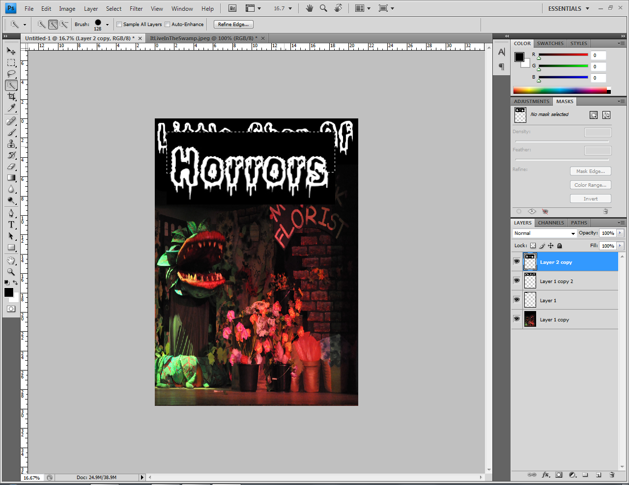
As shown above I took a picture of the props and main character, Audry II, and used it as a background. I think the background has worked really well because it includes the main key points in pictures such as the cenrtral protagonist, the florist shop sign - where most of the movie is shot etc.

I then placed the edited title in position rescaled and resized it supporting the background in such a way it sounds out. I wanted the 'horrors' to be at a larger scale than the rest of the text to reflect the genre. I thought this would be a good idea because having the same style of text and scale is very typical and average hence I decided to be slightly different. I deliperatly used an image of the plant as it is the central protagonist.

Although the white title against the black background contrasts extremely well, I don't nessessarily think it flows fluenty with the poster as a whole, due to this I decided to colour in the title red. As a result the title now looks like red blood dripping down which is very creative considering, once again, the genre of the production is horror.


This is the final outcome of one of my experimentations. I ensured I included all the vital information by using a checklist and getting another student to go over it incase there were any spelling errors. As a whole the page is creative yet simple as I have not used many layers, I explored and discovered that this is a good technique to create a neat and presentable poster which is easily clear to view.
No comments:
Post a Comment