
The above font is called Feast of Flesh, which caught my eye as it is three main things which an eye catching title should include; Bold, Big and powerful. Furthermore, the font is very easy to read which I felt is very important as it helps more possible and interested viewers identify the poster, where ever is maybe allocated in order to advertise the event, and this is important for those who place perfection in their work as a number one decision maker when choosing what developing a title for a poster.

This font is called Treasure and I believe that this font will work well as a title due to the fairly bold lettering as well as the formality of basic lettering it shows. Due to my magazine being aimed at the large age range from kids to adults, I want a passing viewer to not feel as if the show would not be suitable for whatever age they may be.

This font is called You Murderer. I was very interested in this font because the style of the writing links to the horror genre directly due to the rough and distorted lettering. There is also a liquid which seems to be dripping off the text which can be associated with blood. This will be highly effective for my poster due to the direct link and connotations the text gives off which is similar to horror characteristics too.

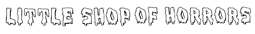
This above typeface is called blood gutter 2000, I find that it is too basic for an adventurous and creative poster I would like to produce in order to attract a large number of viewers. The typeface is far too simple and although it initializes that it is a horror themed font I think it has been created effortlessly hence looked unrealistic. Due to the reasons stated above I find it very difficult to picture this typeface on an astonishing poster I will create therefore I will not use it.
This font is called Meltdown MF. This font caught my eye because it is bald and still adds in the characteristics needed in order to make it look like a title for a horror genre poster. I particularly like the face that I will be able to colour the inside of the typeface on photo shop and even change the colour of the outline if I wish. In regards to my targeted audience I think the font fits well with the wide age group as it may come across as a childlike font yet formal as it is bald and easy to read with its clarity but in a creative method.

This font is called Ghost Writer. What particularly and instantly interested me in this font is that fact that it looks like it has been stamped on and in the 1950’s, when she show is set, a majority of people used to create typefaces using tools such as stamps, typewriter etc. Moreover, although it is fairly simple and basic, with a little bit of photo shop work done upon it, it can look very mysterious and this, in my opinion, is a highly effective characteristic to use in a font for my chosen genre and especially to attract an audience.
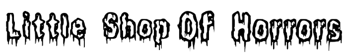
The font above is called It Lives in the Swamp, this font to me looked very similar to the font Meltdown MF and due to its similarity I was also interested in this font. I noticed that it looked like a “new and improved” version of Meltdown MF only to be produced balder, scarier – with a more realistic look of blood dripping from the text and creepier font. It is a conventional font and fits perfectly with all the characteristics needed which would flow fluently, alongside the pictures and other texts, on the poster well.
No comments:
Post a Comment